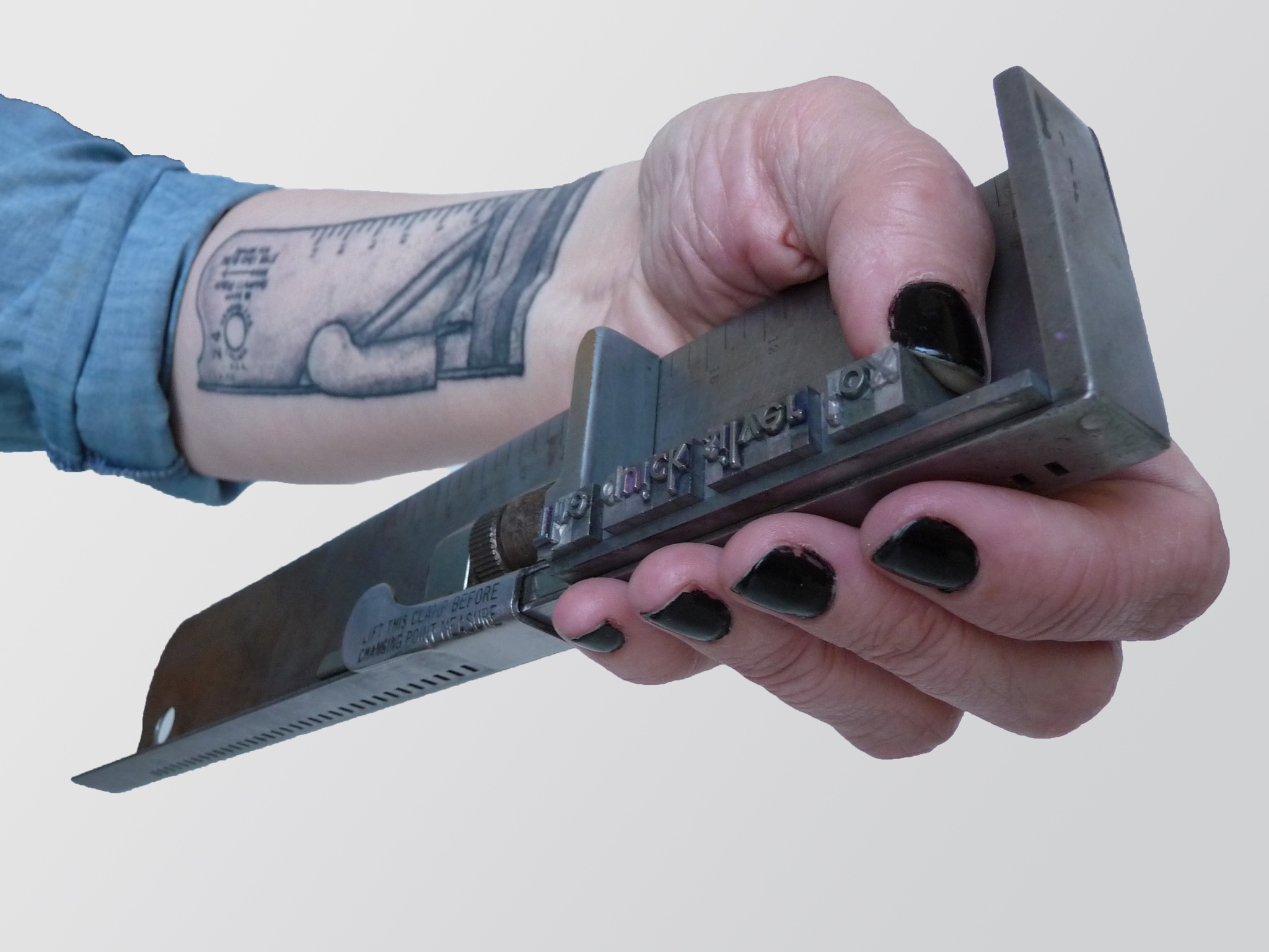
Adele is turning 110 this year. She was named by Kevin Cain, who took care of her before me. He felt printing was like a dance, so he named her after Fred Astaire's first dancing partner, his sister, Adele. Thank you to Noah Fecks for taking the birthday portrait.
Studio Visit
Photographer Noah Fecks stopped by the print studio!
Read moreVintage Metal Type
Here are the sorts that started it all: 60 point Medium Gothic Condensed from our vintage collection of metal type. Our first greeting card and our brand new tote are from this typeface.
Read moreBremelo Press
Selfie.
Read moreFinal week to pre-order Any Fool Can Work totebag with a special gift!
The Strand
Bremelo Press and our letterpress crush Blackbird Letterpress in Ladies of Letterpress at The Strand bookstore in New York. Spotted in the wild by Fruitsuper Design.
Read moreLadies!
Portrait of The Printer
Portrait of the printer, Lynda Sherman of Bremelo Press.
Read moreThank you for a wonderful debut at the National Stationery Show!
We had a fabulous time at our debut at the National Stationery Show in New York last week. Thank you to everyone who stopped to visit and to our new retailers that we are so excited to be working with! And a great big thanks to the Ladies of Letterpress for being such inspiring artists and printers. It was the best to share the experience with you. We met so many great people and are excited to have our greeting cards in new stores!
Read more2015 Best New Product Finalist
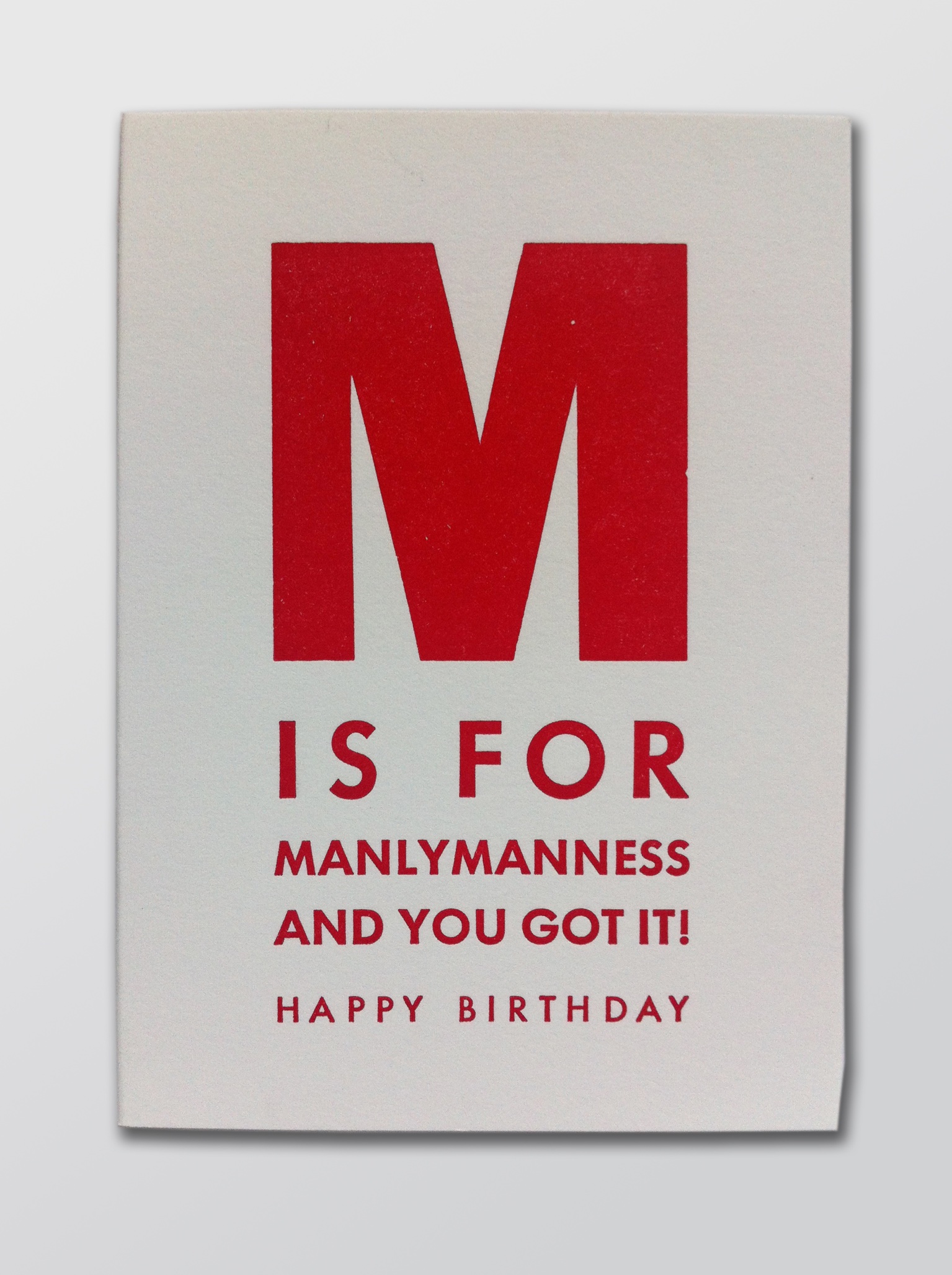
So excited that Bremelo Press' greeting card, M is for MANLYMANNESS, is a finalist in the 2015 Best New Product at the 69th National Stationery Show in NYC in May.
Bremelo Press will be debuting new greeting cards in New York and we can't wait to be there with all the other wonderful makers. Visit us at Booth No.2362 with the Ladies of Letterpress.
Read more
Bremelo Press in T Magazine, the style magazine of The New York Times
So pleased to be recognized in the new book The Ladies of Letterpress by Alexandria Symonds in T Magazine.
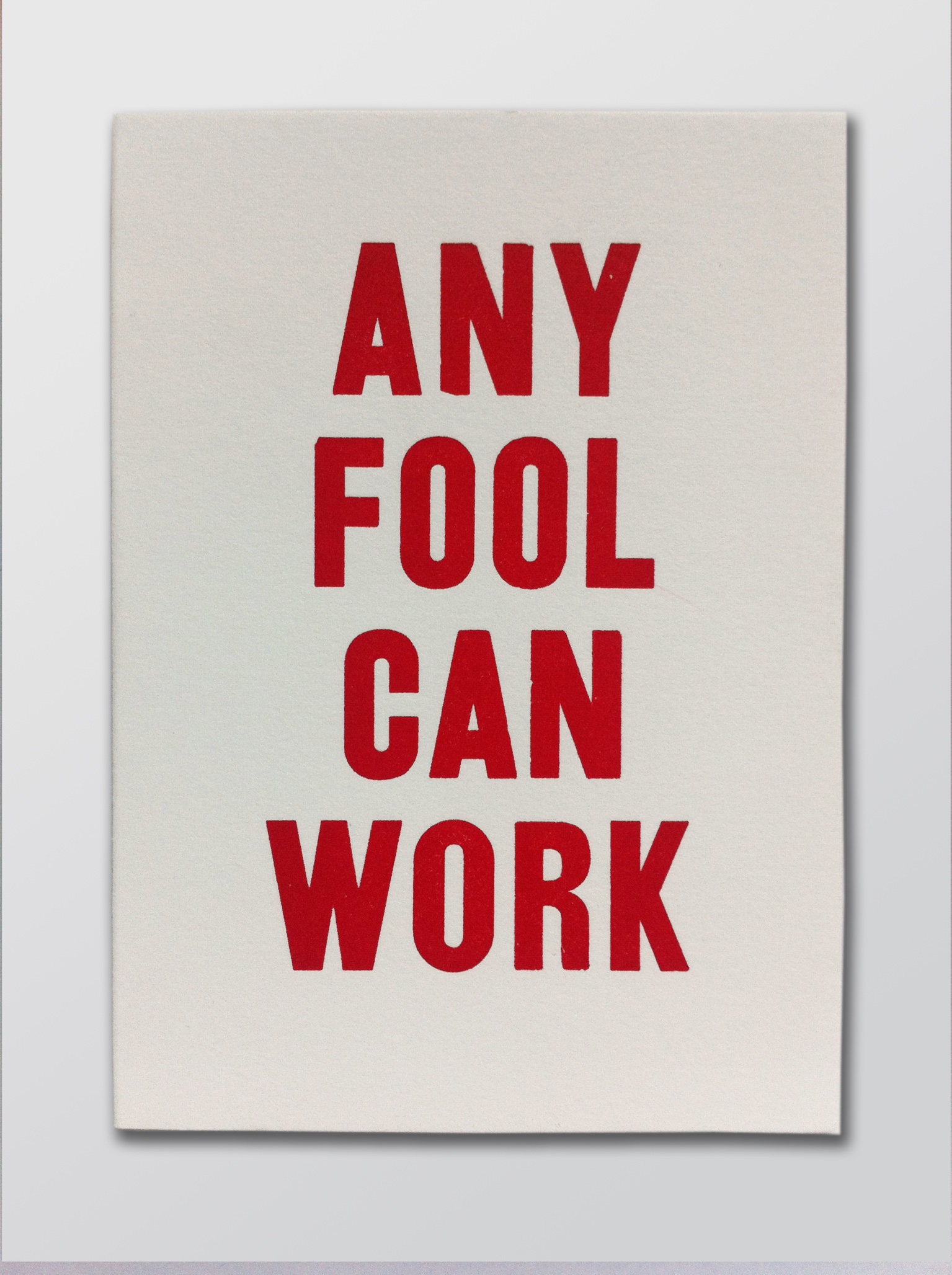
This spring, opt out of buying yet another copy of “Oh, The Places You’ll Go” for the recently minted college grad in your life — she’s sure to receive at least three. Instead, give the new book from Jessica C. White and Kseniya Thomas, the founders of the international trade organization Ladies of Letterpress You may get a befuddled “Thanks?” in response, until you explain that the oversize book contains 86 detachable poster pages, with plenty of prints ideal for decorating the walls of those brand-new, grown-up starter apartments.The posters included run the gamut: pretty and girly (Campbell Raw Press’s gorgeous rendering of Walt Whitman’s “Warble for Lilac-Time”); graphic and abstract (Joey Hannaford’s ombre “Converge II” print); tongue-in-cheek (Gilah Press + Design’s hipster fox); handy (Concrete Lace’s seasonal eating guide, perfect for a tiny kitchen); and, for those in need, inspirational (Mink Letterpress’s print of Max Ehrmann’s very Zen prose poem “Desiderata,” the Hungry Workshop’s exuberant “Stay Hungry” design). I’d package the book with a couple of 11-by-14-inch frames and the gentle suggestion that it’s time to replace the tattered, Blu-Tacked Che Guevara and Warhol banana posters — and perhaps, if your grad isn’t easily offended, a bookmark at page 23, where she’ll find Bremelo Press’s print reading “ANY FOOL CAN WORK.”
- An Unexpected, and Surprisingly Useful, Gift for Grads, Alexandria Symonds, April 21, 2015, T Magazine
Read more5 Questions for Bremelo Press by Gray Magazine
Name: Lynda Sherman
Title: Master Printer
Company: Bremelo Press
Interview by: Rachel Gallaher
Which of your designs or projects are you most excited about right now and why?
My next project is always what excites me. I like to have a puzzle to solve and a deadline to meet.
Tell us three words that embody your design philosophy.
The same three words with which you were taught to cross the road: Stop. Look. Listen. They really help you to get anywhere.
What's your favorite place in the Pacific Northwest and Why?
Ebey's Landing on Whidbey Island; the epic scope of the Puget Sound and the Olympic Mountains after a walk along the Bluff Trail is a reveal that can't be beat.
Who or what are you inspired by right now?
I am inspired by the people I know and the people I am about to meet.
What do you think of the color gray?
The color gray is a warm embrace on a rainy evening; it is shelter from the storm.
Rx
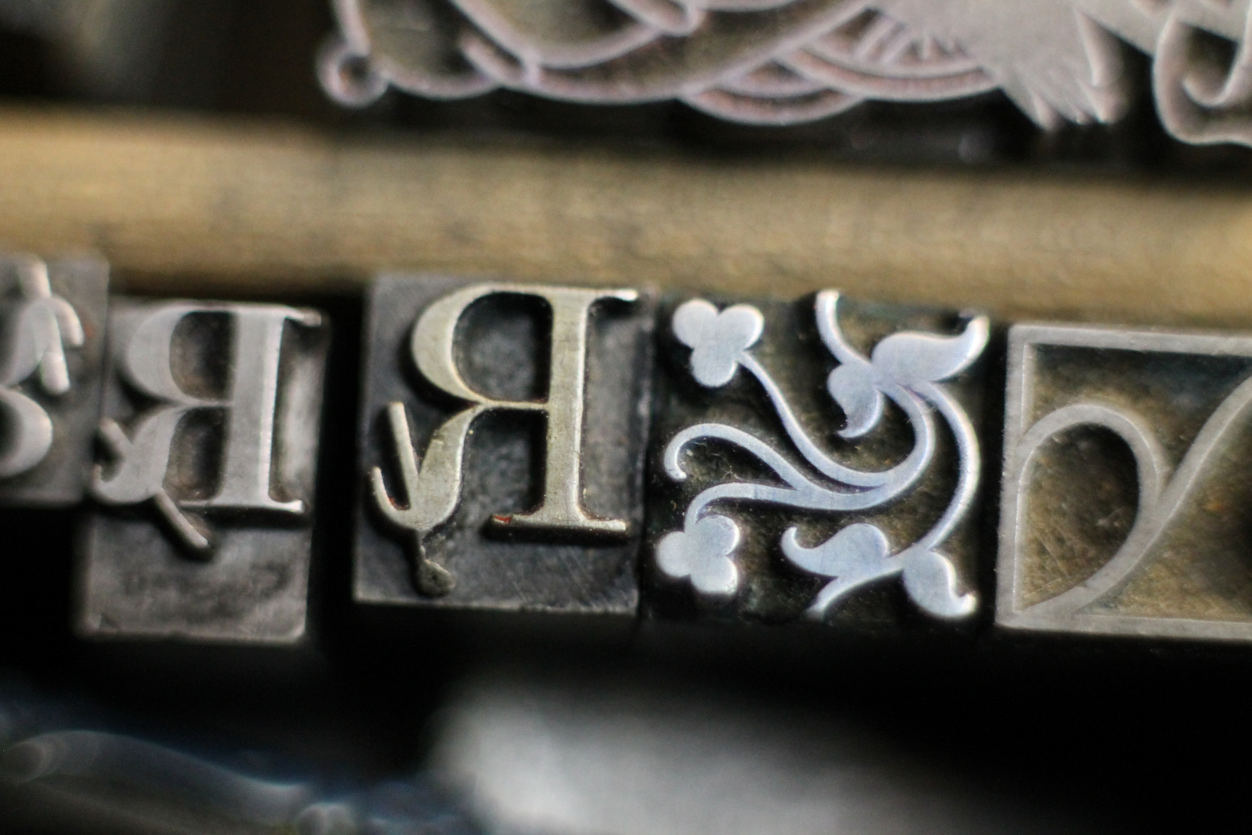
Every picture tells a story. Vintage metal type from our collection here at Bremelo Press.
Read moreLxWxH Curated Box Set
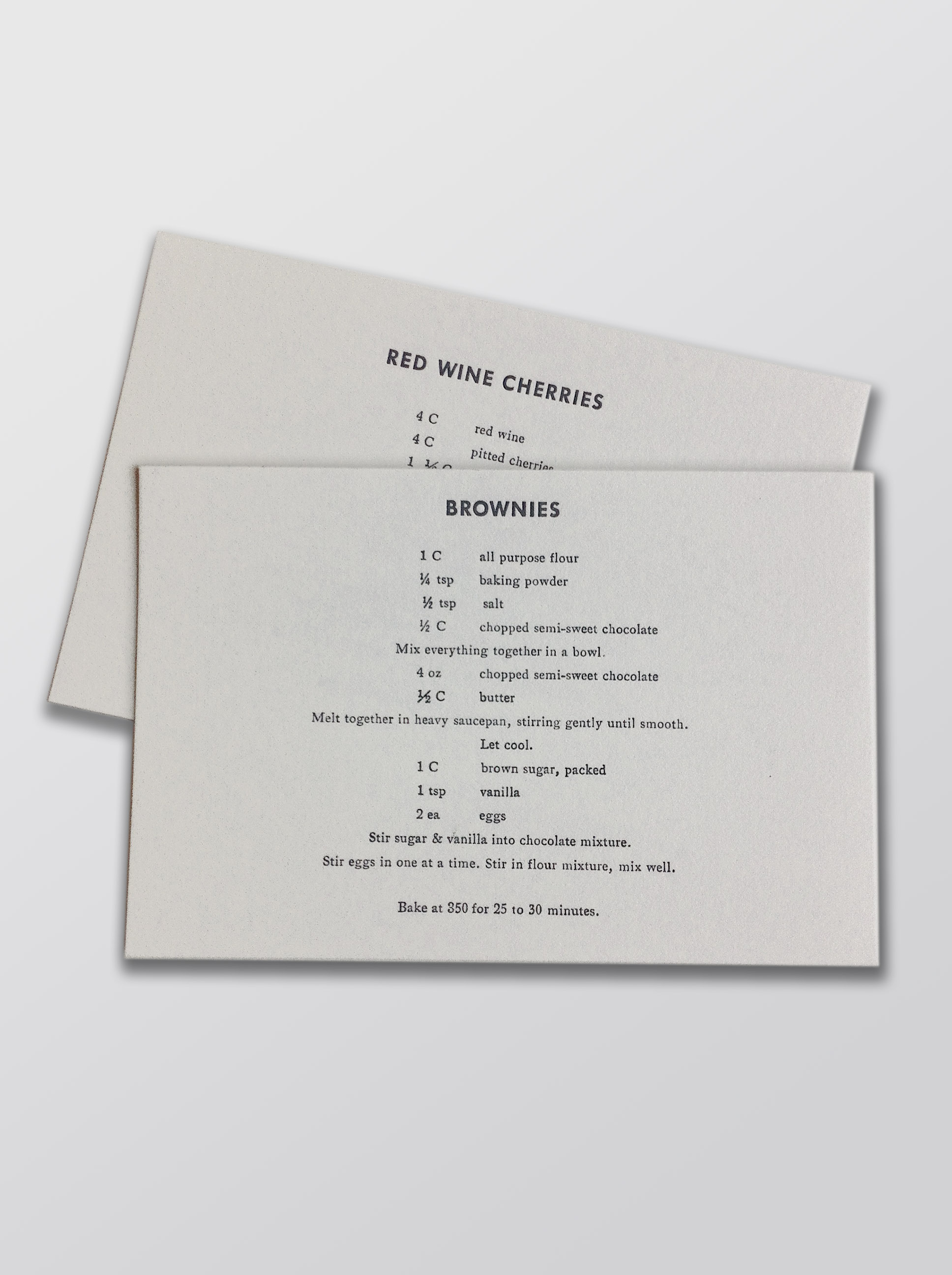
Sharing a good meal with family and friends makes a house a home and a life well lived. These are Sharon Arnold's hand printed recipes and are featured in LxWxH's final curated box set. 'Family Meal' honors sustenance, beauty and community.
Read moreBasics are sometimes best.
Because sometimes a pencil is better than a pen. Photo by Britt McCombs.
Read moreSheila Strobel
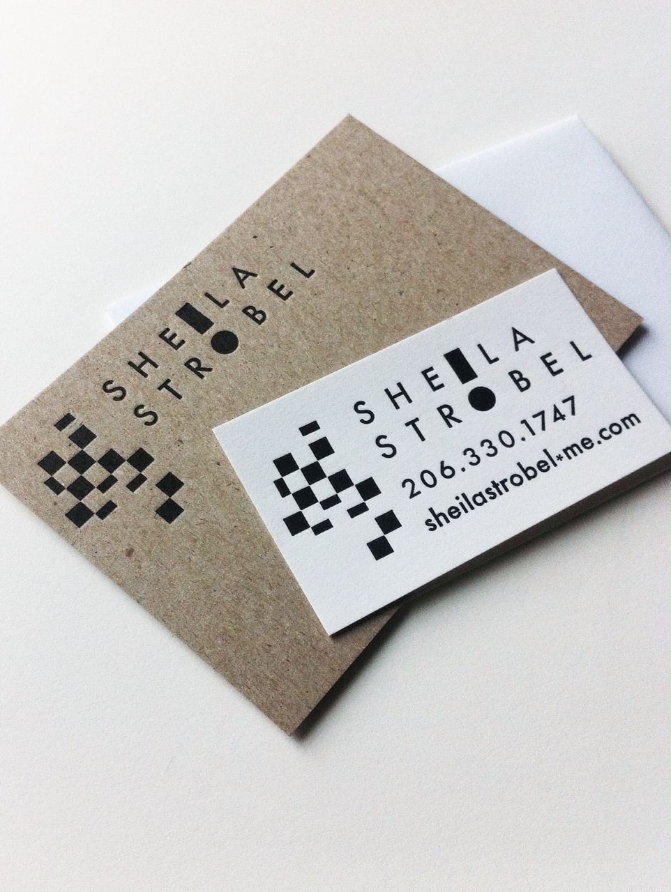
While Sheila and I talked over tea, we realized there was important design history in her family to share on her business card and stationary. Sheila's father Tom Strobel is known for his op art of the 1960's and early '70's. We wanted to re-create this history in the design. As we were working, Sheila asked if she could have an exclamation mark in her name. We found an Alpa-Blox sort and a circle ornament, and made one. Hand set type leads to interesting solutions we wouldn't have thought of on our own. It's the best collaborator and I love it when a good conversation starts an adventure in the print studio.
Read moreIngrid and Michael
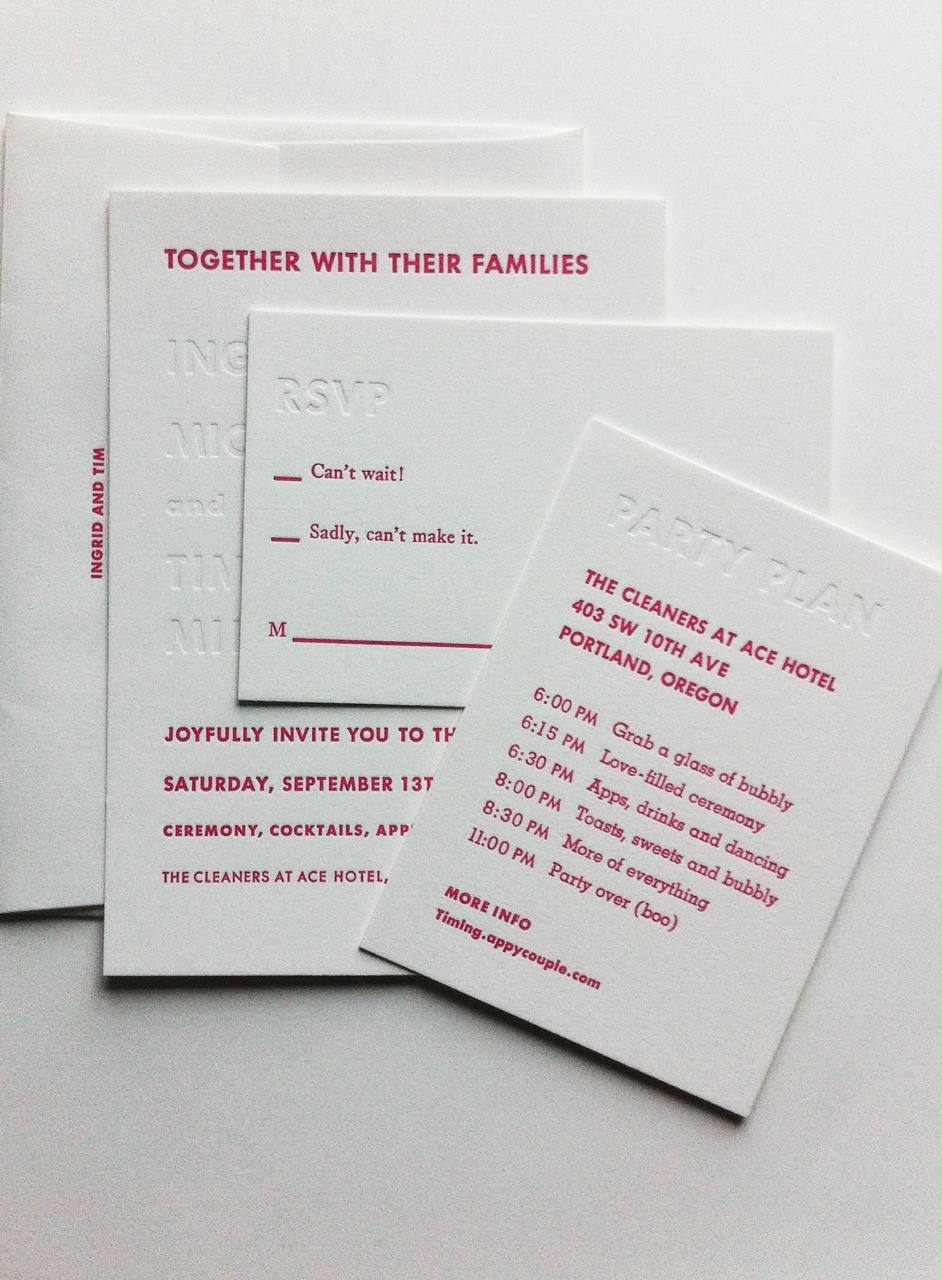
I commend Michael for not saying no to pink. These wedding invitations for Ingrid and Michael are some of the favorite invitations I have made. I love the bold choices and modern look, but printed in classic tradition using vintage hand set type and working with a 109 year old printing press.
Read moreMauri and Matt
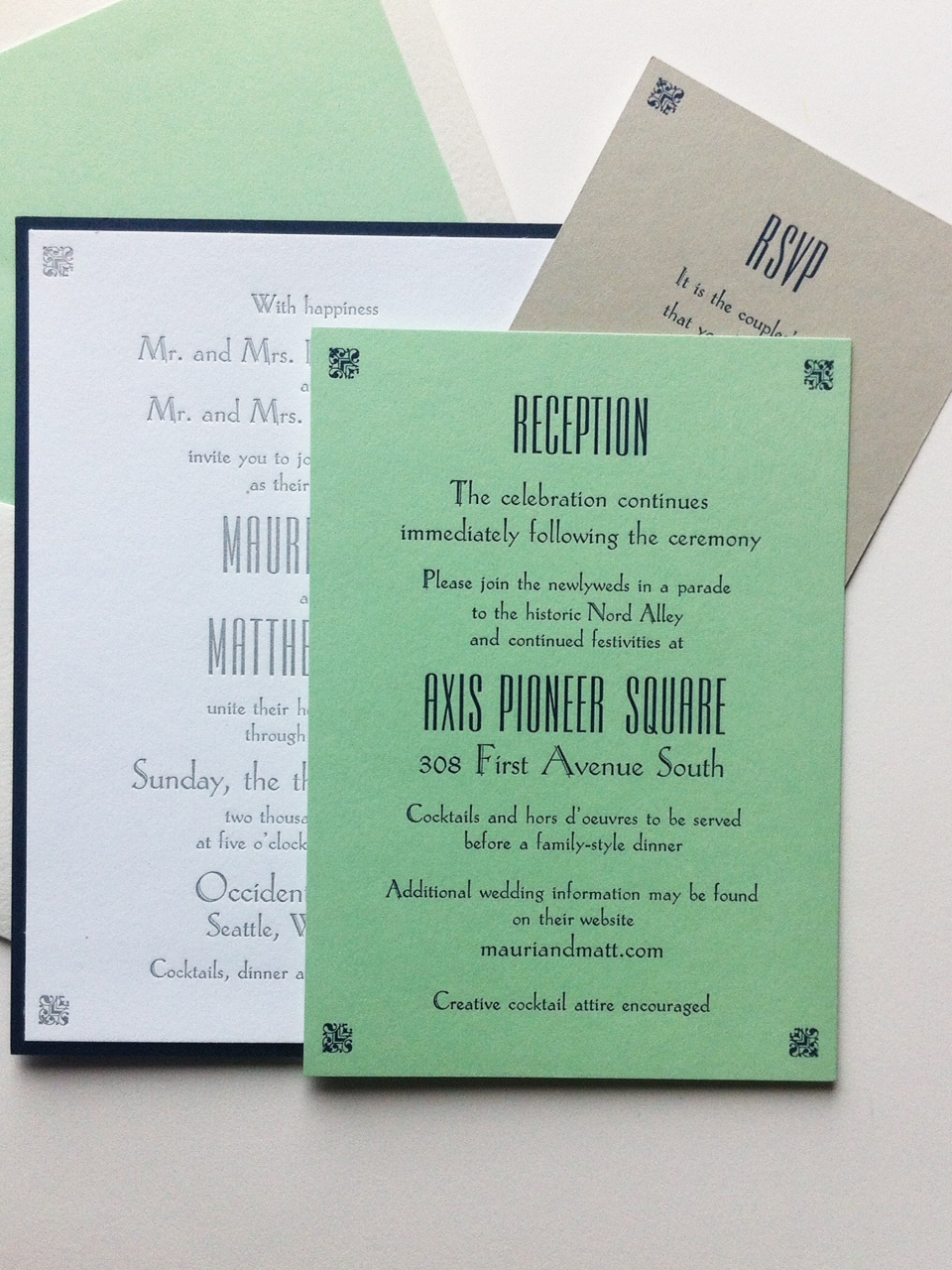
Wedding invitations for Mauri and Matt made with vintage hand set type from our collection here at Bremelo Press. Hand set and printed by the bride and groom. When everything was set, printed and the envelopes lined, we put the invitation together with a beautiful ribbon. That's when Mauri said 'It's better than I imagined'. And that friends, is why I do what I do.
Read moreKristin Zwiers
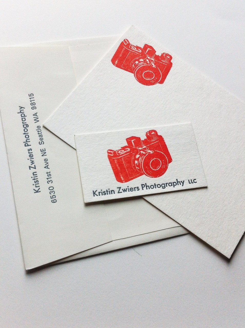
Sometimes, the more simple you go, the better it is. I love this card and stationary set for the photographer Kristin Zwiers for that reason. We've kept the design clean so there is room for her own style to come through. It is like her camera. It is the tool for her creativity, and with it, she will make beautiful things. Stationary as a tool. I've never thought of it like that before and I like it.
Read moreDawn and Jay
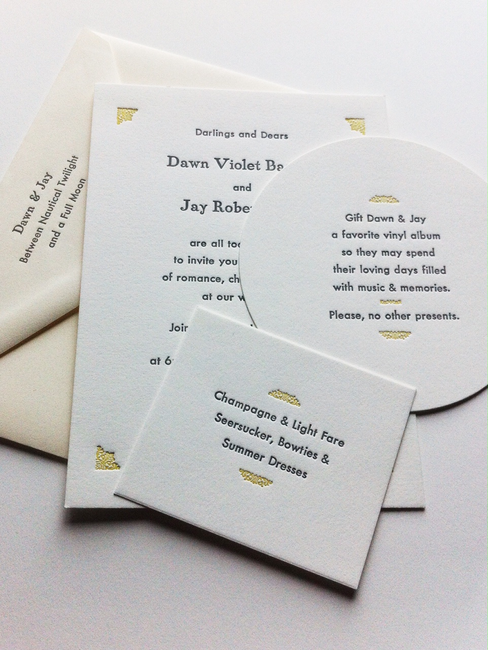
Dawn and Jay are two lovely and talented people. Their love of art and music is so much a part of their invitation. Jay wrote the text on the Outer Envelope and Dawn for the Attire Card, and they are beautiful poems. Having the opportunity to collaborate with people who make a great team is one of the best parts of my job. Watching two people be kind and gentle with each other are simple moments that mean the most.
Read more